Making a chart 3-dimensional
You can add a 3-dimensional effect to bar, stacked bar, pictogram, and stacked pictogram charts.
To add a 3-dimensional effect:
1
Select the chart, then choose Chart Options from the Edit menu.
Tip: You can also double-click the chart.
2
If necessary, click Gallery.
3
Select 3-Dimensional.
You can change the lines around the bars, or remove them using the Pen box in the Accents window.
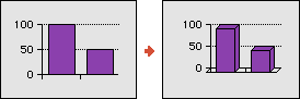
Adding a shadow
You can add a shadow effect to any chart.
To add a shadow to a chart:
1
Select the chart and choose Chart Options from the Edit menu.
Tip: You can also double-click the chart.
2
If necessary, click Gallery.
3
Select Shadow.
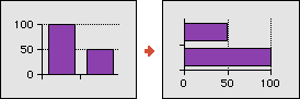
Plotting data horizontally
By default, AppleWorks displays charts with the data divisions horizontally across the X axis and the data points plotted vertically up the Y axis. You can change this orientation so that the data points are plotted horizontally.
You can plot data horizontally for all chart types except X-Y line and X-Y scatter charts. Plotting a pie chart horizontally arranges the pies from left to right instead of top to bottom.
To plot data horizontally:
1
Select the chart and choose Chart Options from the Edit menu.
Tip: You can also double-click the chart.
2
If necessary, click Gallery.
3
Select Horizontal.
For more information about other special effects you can apply to charts, see these topics:
Adding or adjusting color in charts
Adding graphics and type to charts
Applying special effects to pie charts
Table of contents | Index