You can turn the data in a spreadsheet into a chart. Charts (also called graphs) can visually reveal trends or relationships that aren't as apparent when you view the data in rows and columns.
A chart is linked to the spreadsheet it's based on. If you change the data in the spreadsheet, the chart updates automatically.
You can create a chart using part or all of the data in a spreadsheet, and you can create various types of charts from the same data.
Parts of a chart
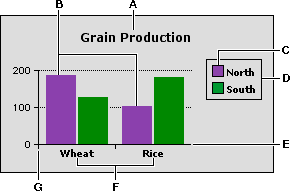
A
Title
B
Data series
C
Series box
D
Legend
E
X axis
F
Divisions
G
Y axis
A chart comprises several parts:
•
Title (optional): Explains the contents of the chart.
•
Data series and divisions: Each set of values in a chart is a data series. In a bar chart, for example, the bars represent the data series.
Series can be broken into divisions such as intervals or categories.
•
Legend (optional): Identifies what the series represent.
•
Series box (optional): Used in the legend to show a sample of the color or symbol that represents each series.
•
Axes: Perpendicular lines used to plot data. Tick marks and grid lines show intervals. (Pie charts don't have axes.)
You can also turn the data in a spreadsheet frame into a chart.
Related topics
Table of contents | Index