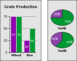
You can display numeric values for the data series on the chart.
Note: For pie charts, AppleWorks displays percentages of the total instead of the data values.
To add or change data labels:
1
Select the chart, then choose Chart Options from the Edit menu and click Series.
Tip: You can also double-click a series box in the legend, if the chart has a legend.
2
Choose a data series from the "Edit series" pop-up menu.
For scatter and X-Y scatter charts, you must select a series. For area, stacked area, line, and X-Y line charts, you can change one series at a time or choose All to make the same changes to all series.
3
Click the "Label data" checkbox.
4
For every chart type except pie, click a circle to position the label in relation to its data point.

If you don't see the data labels in the chart:
The color of the text might not contrast enough with the color of the data series. Use the text formatting commands in the Format menu to change the text color, size, or style.
Related topics
Adding and formatting chart text
Changing the symbols used to plot data
Adding graphics and type to charts
Types of charts
Table of contents | Index