X-Y charts use two columns of spreadsheet data to plot values for a single data series. Each pair of values determines the position of one data point.

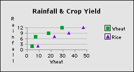
In the spreadsheet above, the values in columns B and C are the first data series (Wheat). For the first data point, the first value in column B (4) determines the position along the X axis, and the first value in column C (2) determines the position along the Y axis. The following chart plots columns B through E of the spreadsheet (notice that the values in columns C and E are identical to make the comparison valid):

The chart above is an X-Y scatter chart; the same data can be represented as an X-Y line chart by connecting the data points in each series with a line.
Scatter charts can show how a change in the value of one set of data affects the value of another set of data. In scatter charts, clumps of data points are easy to spot and usually indicate a relationship or dependence between sets of data. An even distribution of points often indicates the lack of a relationship.
Tip: To help distinguish between sets of data, use a different symbol for each data series.
Related topic
Table of contents | Index