For all chart types except pie charts, you can
•
add axis labels
•
display a grid behind the plotted data (for either or both axes)
•
display and modify the tick marks along the axes
To format the X and Y axes:
1
Select the chart, then choose Chart Options from the Edit menu and click Axes.
Tip: You can also double-click either of the axes in the chart.
2
Click "X axis" or "Y axis."
You format each axis independently.
3
Select the options you want.
•
Tick Marks: Choose a placement option from the pop-up menu (choose None to turn off tick marks).
•
Minor: The number of tick marks between major tick marks
•
Minimum and Maximum: The lowest and highest values that will be plotted on the axis (useful for focusing on a specific range of data values)
•
Step size: The distance between major tick marks
•
Log: For displaying axis values in a logarithmic scale (type a log base in the box)
Specifying more options for axes labels, grid lines, and tick marks
Typically, the X axis label identifies the series divisions and the Y label identifies the unit of measure or the scale, but you can switch this.
To specify text attributes for either axis label or, on the Y axis, the numbers next to tick marks:
| • | Select the X or Y axis in the chart and use text formatting commands in the Format menu. |
| To format the division labels (the text next to tick marks on the X axis), format it in the spreadsheet. |
To change the color and width of axis lines and the color of grid lines:
| • | Select the X or Y axis in the chart and specify a pen color and line width in the Accents window. |
| Note: You can't apply patterns, wallpaper, or gradients to chart lines. |
Tick marks
Grid lines
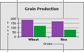
Y axis label
X axis label
If you don't see tick marks:
They might be covered up by wide axis lines. Reduce the width of axis lines with the line style panel in the Accents window.
Related topics
Table of contents | Index