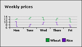
Hi-low charts plot a high point and a low point for each data series. The two points are connected with a line. You need two rows or columns of spreadsheet data for each data series.
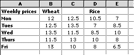
In the spreadsheet above, columns B and D show the opening market price and columns C and E show the closing market price.
The spreadsheet data is plotted in the following chart. In each plotted pair, the opening price value is the leftmost mark. The closing price is the rightmost. Notice how each day's opening value is the same as the previous day's closing value.
Related topic
Table of contents | Index